The cost decision in Kindred Hands had a purpose behind it. I wanted to help weavers reach customers more directly without our taking commission, and the initiative was intended as not-for-profit. Continuing costs around the initial WordPress and Dokan route led me to alternatives, which I linked with guidance.
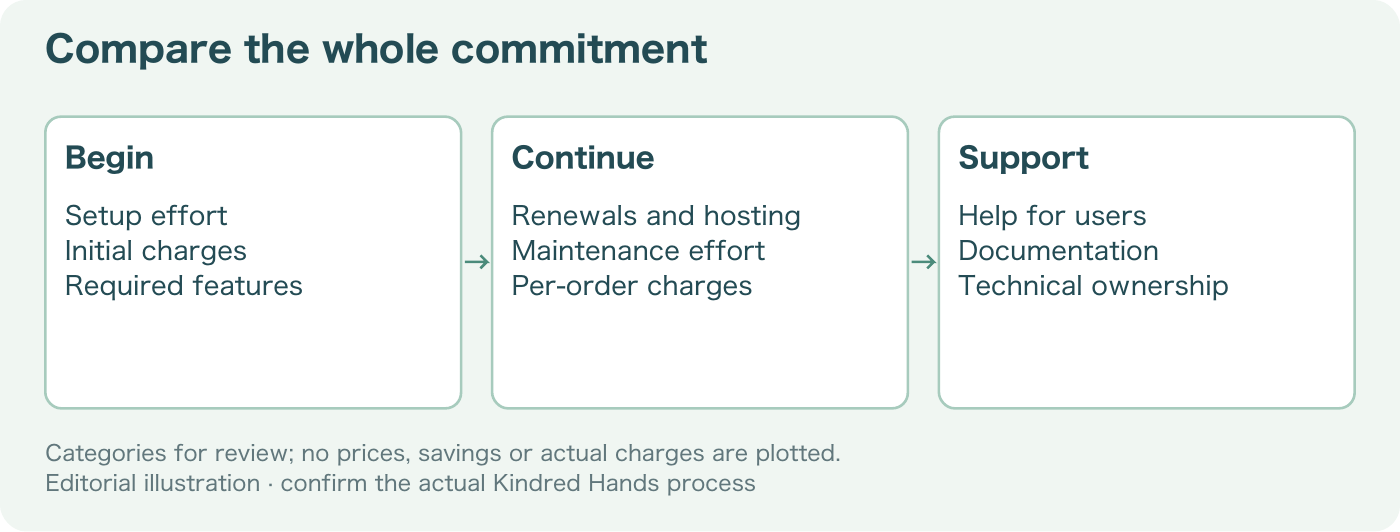
That made comparing the arrangements more interesting than comparing a first price. WordPress itself is open source, and the multi-vendor option has free and paid versions, so broad labels do not explain the commitments. The useful comparison keeps the same jobs and the same period in view. Otherwise I could make one side look more affordable simply by leaving some of its work outside the total. The reason for the choice should remain understandable after the excitement of finding another option has passed.
I want the same set of needs on both sides. If one route includes a particular responsibility and another leaves it for somebody to handle, that difference belongs in the comparison. It may still be sensible to choose the second route. I just need to know what the choice includes, rather than let the missing line improve the total automatically.
A comparison needs more than two amounts placed beside each other. The period, the job and the kind of cost should be visible. That lets someone understand the reason for the decision rather than accept a smaller total without knowing what it includes.
The time period comes first. A one-time setup amount and a monthly charge cannot be compared directly without deciding how long the setup is being considered for. A simple planning expression is a starting cost plus the recurring amount multiplied by the number of periods. That’s only a model. It does not magically include changing charges, support work or things I have forgotten to put into it.
The useful part of that expression is the question it forces me to ask about every amount. Is this paid once? Does it repeat? Does it depend on use? What period does it describe? I don’t need numbers to see why the labels matter. If the labels are wrong, very accurate arithmetic will still give me an answer to the wrong comparison.
Hosting remains relevant on the open-source side. So do maintenance and the work of helping people use the site. Some of that work might be done by volunteers rather than paid for directly. I should not turn volunteer time into a cash amount without an agreed basis, but I should not make it invisible either. The organisation still depends on somebody being able to do the task.
I also want to separate a quoted cost from a forecast and an actual payment. A quote records what an option offered under particular conditions. A forecast uses assumptions about what the organisation may need. A payment says something was actually spent. Putting all three into one column without labels could make the story sound more certain than it is.
A feature comparison shows another problem. In this case, the first route covers a useful task through a paid option, and the new combination leaves a manual step. The cost of the manual step depends on what it involves and who can handle it. I can’t call the routes equivalent simply because a buyer sees a similar page. I have to compare the work behind the page too.
There can also be reasons to prefer an arrangement that is easier to understand, even if it is not the smallest total under every assumption. If the people maintaining it can follow the process and explain what needs attention, that may matter. I don’t have to pretend every valuable difference has a precise number beside it. I do have to explain the difference clearly enough that it can be discussed.
This is a good place to revisit the decision with my mentor. The question is not whether the open-source route deserves to win. It’s whether the comparison treats both routes fairly. Which responsibilities have I left out? Which assumptions are uncertain? What would change the conclusion if the organisation's needs changed?
I like that this makes the decision easier to revisit later. A conclusion without reasons is difficult to update. A comparison with the jobs, periods and assumptions visible can be checked again. The people using Kindred Hands should not have to accept the setup because I once decided it looked affordable.
The comparison can also show what would make the decision change. If one assumption depends heavily on how often a task occurs, I want that dependence visible. A route that is manageable for occasional use might ask more of the people maintaining it as use grows. I don’t have to predict an order volume to recognise that some commitments change with activity and others do not.
The same idea applies to support. If a choice is sensible because a particular kind of help is available, that is part of the assumption. It should not disappear from the account simply because no immediate payment is attached. I would rather explain the condition than write a saving that seems to apply regardless of who is around to do the work.
This makes the table less like a score and more like an explanation. There may be unknown amounts and differences that cannot honestly be added into one number. A clear note about those limits gives the organisation something more useful than a total that looks precise because all the difficult questions were left outside it.
What I want from the change of route is a set of commitments the organisation can understand and carry. The point is not to produce the most impressive savings sentence. It’s to choose a setup whose costs and work still make sense after I stop being excited about having found another option.